
User Experience Should Be Step One of Your Design Process
Let’s start with the obvious and something others are not telling you, your website is not about you – it’s about your user, and that’s why user experience should be top of the planning checklist.
Your website is the chance to show off what you’re all about, including the solutions that your visitor went to Google (or any other search engine) for in the first place. You want your site to be the place your customers go for information, useful content, actionable advice, and to buy.
Them, not you!
You can tell what’s working by watching your interactions, engagement, and numbers. Use analytics to ensure they are landing in the right areas, not leaving once they get there, and taking some action.
When planning your site together, you should always think about user experience to help visitors find the right information and product. This will help them decide if what you offer is the solution to their needs and why they should buy from you or keep in touch, like signing up for a newsletter or being on your list.
You’ll check your site’s analytics to note how people behave on your site. Where are they clicking, where are they leaving, and where are they spending time?
When you notice a high bounce rate (people leaving after clicking on only one page) or a low visit time of 30 seconds or less, people aren’t finding what they’re looking for.
When that happens, it’s time to change the experience and make it good. Here are a few tips to help you do that.
Create A Good User Experience
Test your website speed
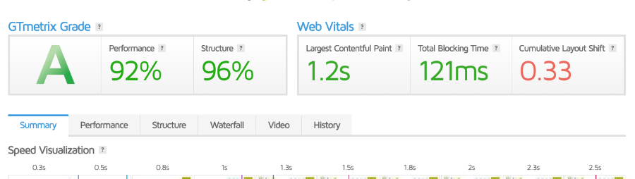
Your page must load as quickly as possible – people are impatient and won’t wait for that to happen. GTMetrix and Page Speed Insights give you a starting point to improve speed and performance. Start here because if your site takes forever to load, you’ve lost them.
Design for the user
It’s so tempting to design with our tastes in mind, but that won’t help the user complete tasks on your site. It’s the design team’s job to make sure that the entire experience meets the user’s needs. You have to determine what they’ve come for – are they browsing, searching, watching a video, or reading an article? Listen to their conversations and questions that they are having about their problems.
Because this isn’t about you, you’ll need to know a lot about your buyer. Parts of your site like your sales pages, while other pages like your Home and Work With Me may need to hit on a particular piece of your perfect clients like mom lifestyle bloggers or corporate carryovers with established side gigs. It’s easy to start with why they are in search of an answer.
Find out about their online habits. Determine if they are browsers, comparison shoppers, looking for specific content, or just killing time. By knowing the type of content they are consuming, we’ll allow you to create a better user experience.
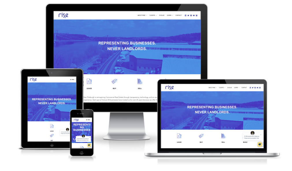
Make it responsive
Many people use their phones or tablets to surf, shop, and stay informed. So your site must look good on all devices. Mobile responsive sites are given, and if your website theme was designed, your site recently should be too.
One way to find what devices ad browsers people use is to grab your Analytics or Google Search Console results to see how people are accessing your website.
But being mobile responsive is not enough, and you need to make sure that your site functions across all devices. The easiest way to do this is to grab your devices and pull up your website.
Is it working in the way that you had hoped? Look at the beautiful big banner at the top; it is readable on a smaller screen. Or how about the big button on mobile? Is it tiny and readable on a large desktop?
Clear calls to action
When we hear the call to action, we think to buy now or sign up, but this doesn’t encompass the whole call to action realm. Your call or calls to action should be added if they are logical to the design. And I”m not talking about some pretty button or attractive signup form.
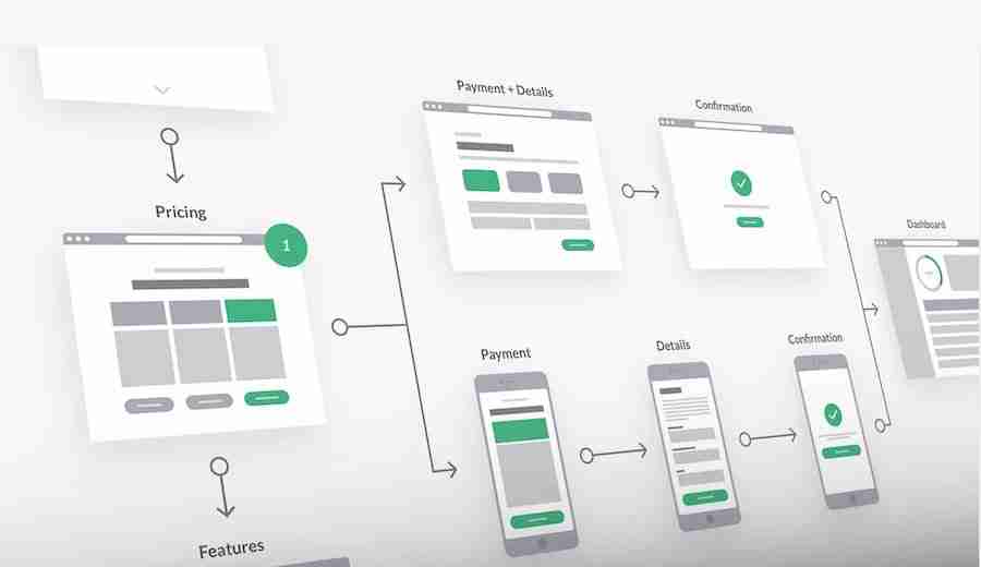
Strategically place links and other action items throughout your content so that it is designed to lead the visitor to the next logical step in the process. But be sure your calls to action enhance the user experience and not be placed for SEO bots and ranking.
Keep each step of the journey in mind. Hubspot outlines three parts to the journey: Awareness, Consideration, and Decision. Use that as a guide to how you present your information and how you will lead your potential client to the next step.
Think about your buyer’s decisions and the path they take to get to you and to buy from you. Not many people land on a website and think it’s time for them to click the buy now button. Buying is only the tip of the iceberg. You need to factor in easy checkout, confirming the order (or appointment or download), and you need to have factors in place for follow-up.
Practice less is more
You might think this doesn’t apply to you or is an obvious concept, but many sites tend to get it wrong. You need to cut down on tasks required by the user. If it doesn’t add value or distract and confuse the user, get rid of the clutter first. Remember, white space is your friend, and animations may not be necessary.
Then determine the exact process that someone needs to take to get them from problem to solution in as few steps as possible. Our users want things to be simple, worry-free, and fast; giving them simply will surely make them happy.
Keep things consistent
Start with your visual brand because consistency means everything should match. Heading sizes, typography, colors, button styles, and image choices. Everything. You want your user to land on your site and realize they are in the right place.
You should also keep the pages following a familiar pattern. Your logo is on the left, and navigation is on the right. Hero image or heading with background image at the top, some contents below on a full-width page. A top bar above the header has your latest announcement. These are consistent pieces of the layout and something that should flow from page to page to page.
And consider consistency on your stripped-down pages like your sales page. Be sure that your visual brand and vibes are evident there too. You don’t want your overall site to be zen with a nature vibe and your lead capture squeeze page to look like it belongs at the circus.
Wrap-Up
There’s no one size fits all solution when it comes to user experience, and you’ll have to monitor what is working and what needs to be changed. Web design is an ongoing process, and Google Analytics can help find what is working.
Are you designing your WordPress website with user experience as a guide?