Website Clutter: Clean Up The Chaos On Your Website
Website clutter is real and can affect how your visitors interact (or not) with your website.
I have a friend who operates in what she calls organized chaos, and it’s amazing what she gets done in a day. When a lot is happening around me (repetitive loud noises, fast-moving things, and clutter, oh the clutter), I get easily distracted and tend to forget what is happening.
That happens a lot in the digital realm, and the distraction includes clutter and chaos on websites.
According to web credibility research from Stanford, 75% of users admit to making judgments about a company’s credibility based on its website’s design.
So can you imagine someone landing on your site and there is so much going on they don’t know how to process any of it? They’re even left to wonder if this is how they run their business: chaos and clutter.
Now imagine the challenge of reviewing a website that has everything and the kitchen sink—not knowing what to do first, where to begin, or whether a visitor will want to stay.
Trying to make a decision is hard. Really hard.
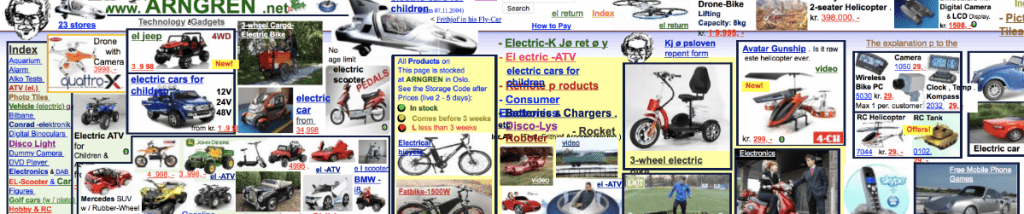
Is your website filled with clutter and chaos?
Steve Krug once wrote a popular web usability book called Don’t Make Me Think. The idea behind the book is to get visitors to navigate your website without having to think too much.
We are a point, click and scroll nation. And many of us are impatient because we know that it’s now or never. Distractions drive our lives, and simple is welcome.
Website clutter can be a killer for conversions, especially in the age of the distraction economy. Information overload is causing a gap between the amount of information we’re faced with and the capacity to consume that information.
When someone comes to your website, they want clean, clear, and well-organized information (UI) to find what they need as quickly as possible. And they want this without getting distracted.
Then there’s this thing called website accessibility. Basically, it’s a set of standards to make your website easy for those with disabilities to use. You need to factor that in too.
What is Website Clutter?
Clutter, or chaos, as some call it, is the context of web design that allows the website to live up to its purpose.
A cluttered website will turn someone off from your site. Because the overwhelm sets in, they won’t stick around to try and make heads or tails of your information.
Cluttered designs usually lack visual and organizational order, making the user struggle to understand which part is important.
It’s easy to identify the three parts of the design that can cause clutter.
Three Main Parts Of Website Design Clutter
1. Too much content on the screen
Wondering how to fix this clutter mistake? Planning is the answer.
You’ll want to plan your website around results and the results you want your visitors (and potential clients) to achieve. Rather than throwing text and images onto the page and trying to see what sticks, figure out the end goal and work people towards that.
You’ll find that you may not need as much information or many steps to get them there, and this alone can cut down clutter. You’ll have a clear vision of what action will need to be placed where and how many objections the visitor may have.
Remember, every link you place in your content and on your pages can be a potential distraction. Those distractions can lead visitors to forget what they were originally there for.
Action: Use your funnel as your guide defining what steps each part of the journey will require. Plan your page(s) based on that funnel.
2. Content is not organized in a logical manner
Content is king, queen, and everything in between.
Your content is paramount to the success of your site. High-quality content should inform, entertain, and gauge or sell a product. And it should be organized so that it is accessible or findable to the visitor.
The best way to do this is to prioritize your content, making sure your visitors find the information you want them to find by arranging your content to reflect what is most important.
Using the funnel that you’ve outlined, the first thing you need to determine is your goal. Once you have determined the goal, you can tailor content to fit each step of that journey. If you’re selling products, you’ll need to hit on the benefits of the product and answer customers’ questions, and, most importantly tell them how to buy.
If you get stuck on this step, visit sites similar to yours that you think will be of interest to your target audience. How are they arranging the information? Are there things that they are hitting on or maybe missing or hard to find?
Action: Make a list of all the necessary content to reach your goal. Then prioritize that information to determine the placement of the content. Make sure that you think about what the user wants. This step might take some time, but it is really a key part of organizing your website.
3. Too much visual noise
When we think of visuals, we, for the most part, think of pictures and graphics. But visual design, including visual clutter, can also encompass colors, fonts, and other visual elements.
The first step to making a visually clean or appealing website is to ensure cohesion in your style and brand. Because this is what first catches the eye, and our brains are sense-making machines.
Color is the most powerful subliminal visual tool the buyer’s influences a buyer’s decision. So you want to test different colors to determine what is most effective, and you certainly don’t want to vomit too many colors to wear the brain can’t process your information visually.
And remember, a picture tells 1000 words, but a wrong picture won’t enhance your message, and multiple images may confuse your message. So you want to use your images sparingly to ensure that they add to the story and not distract from it.
A study conducted by Adobe found that more than 66% of website users judge a website on its graphics quality within the first 15 minutes of landing on the homepage.
And finally, you have whitespace; whitespace is an undervalued commodity. It’s the breathing room on your website. Whitespace is like a welcome break in your busy day. It allows you to take a moment to focus on what’s important.
And remember, the mobile does not give you a lot of visual room. So don’t stuff it up with images, videos, or other visual clutter. Besides it being busy and noisy, images take up a lot of bandwidth, so you want to remember that for your mobile visitors.
Action: The first thing you want to check is to make sure that you’re using the right color scheme and keeping your font choices to a minimum. Then you want to move your elements; you don’t want to be sticking things willy-nilly. Make sure that the visual cues you are using enhance your message. Don’t add an icon just for the sake of adding an icon. You might be able to do away with the images and add a little more whitespace or breathing room.
Recap
Website clutter is the main reason people don’t engage with your website, so remember those simple distractions that confuse your visitors. And be sure to create clear paths to get information that will help with solutions. Need some help getting your website ducks in order? Schedule a consult to help you get a game plan in place.